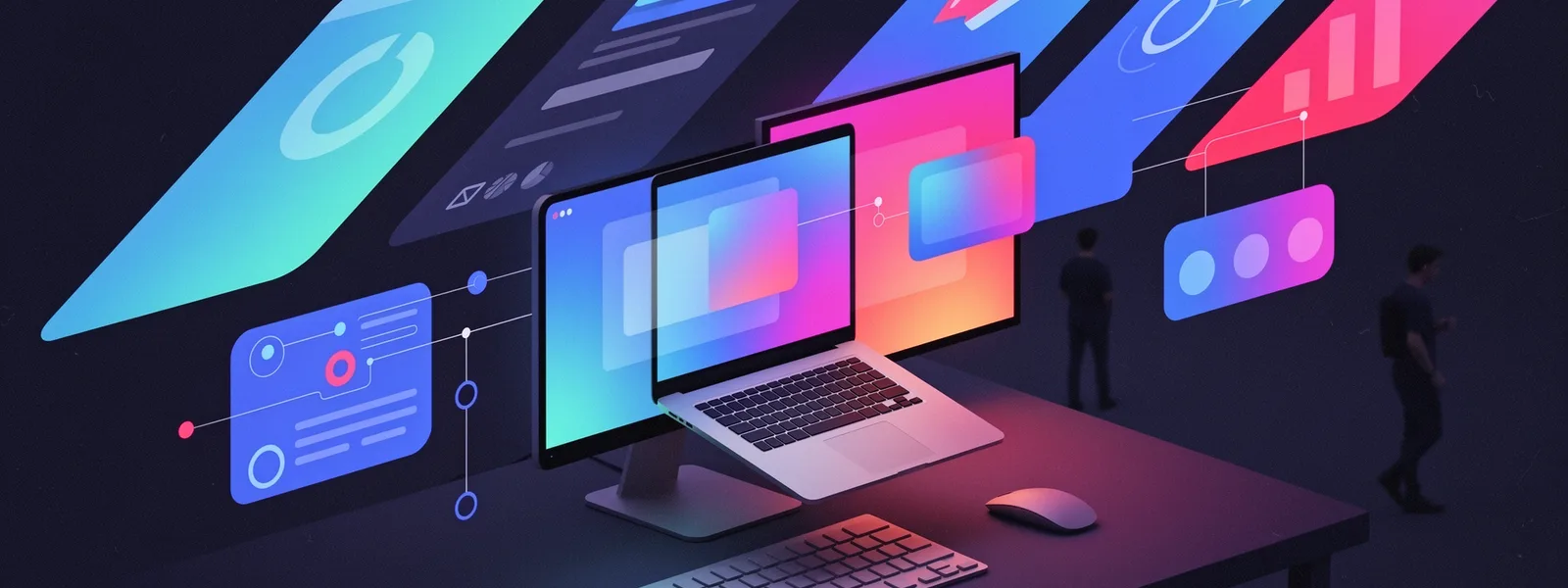
Every developer has been there. You add a slick hover effect or an animated progress bar to a user interface, expecting it to captivate users, only to watch the analytics show zero change in interaction rates. The disconnect isn't about the code; it's about the intent. Interactive UI design is not a cosmetic upgrade. It's a functional layer of communication between your application and the people who use it, turning passive viewers into active participants.
This transformation hinges on a core principle: interactive elements must provide clear value, not just visual spectacle. To truly enhance user engagement, we need to move beyond pre-built component libraries and consider the psychology of interaction, the mechanics of performance, and the measurable outcomes. This guide breaks down the process of building interactive UIs that users not only notice but need.
What does a successful interactive element actually do?
Consider a filterable data table. A basic implementation might have static checkboxes. An interactive one provides immediate visual feedback as options are selected, updates the visible dataset in real-time without a page reload, and perhaps even animates the filtering process to guide the user's eye. The goal isn't to make things move. The goal is to make the system's state understandable and the user's control over it feel immediate and powerful.
Successful interaction design answers three questions for the user: What just happened? What can I do now? How does my action affect the system? Each micro-interaction, from a button press to a drag-and-drop, should close this feedback loop instantly. When this loop is broken by lag, unclear states, or unresponsive elements, engagement plummets. Users don't just get frustrated; they mentally downgrade the application's reliability.

From visual feedback to cognitive understanding
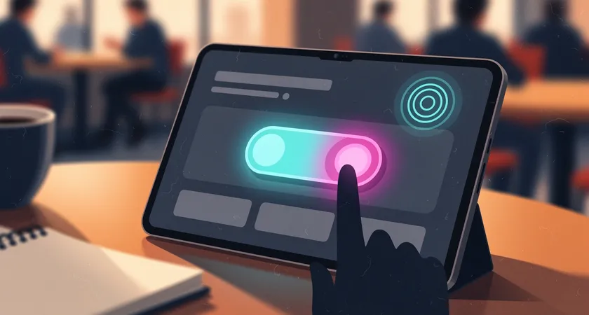
The most fundamental interactive tool is feedback. A button must change state on hover and press. But the depth of this feedback is what separates functional from engaging. Does the button depress visually? Does it emit a subtle sound on a platform that supports it? Does a loading spinner appear that is branded and informative, not just a generic graphic? This multi-sensory confirmation reduces user anxiety. It tells them the system has received their command and is working on it, which is crucial for building trust during multi-step processes.
This principle extends to form validation. Inline validation that highlights a field in green as soon as a valid email format is entered is far more engaging and effective than a batch of red errors upon submission. It turns a potential moment of failure into a moment of positive reinforcement, guiding the user forward rather than scolding them after the fact.
Balancing creativity with browser performance
A common pitfall in pursuing engagement is the overuse of heavy JavaScript animations or complex CSS transforms that look impressive in isolation but bring a user's browser to its knees. Performance is a direct component of the user experience. A stunning 3D carousel that stutters and lags on mid-range devices doesn't delight; it alienates.
The technical strategy here is two-fold. First, lean on native browser capabilities wherever possible. CSS transitions and animations are typically handled by the browser's compositor thread, making them smoother and less taxing than JavaScript-driven equivalents for simple properties like opacity and transform. Second, be ruthless about measurement. Use your browser's performance profiler to see the cost of your interactions. An animation that takes more than 16 milliseconds to render a frame (aiming for 60fps) will cause perceptible jank.
The role of lazy loading and intersection observers
Not all interactions need to be ready the moment the page loads. For elements below the fold, such as interactive charts or complex hover effects on product listings, use the Intersection Observer API. This allows you to trigger the loading of scripts, animations, or data only when the user scrolls the element into view. This technique drastically improves initial page load times, a key metric for both user retention and search engine ranking. The interaction becomes a reward for scrolling, not a penalty for arriving.

Choosing the right interaction for the job
The landscape of interactive possibilities is vast: parallax scrolling, drag-and-drop interfaces, gesture controls on mobile, real-time collaborative cursors, voice commands. The temptation to use a new technology because it is novel is strong. The discipline lies in matching the interaction model to the user's mental model and the core task.
For example, drag-and-drop is intuitive for organizing items in a list or uploading files. It feels direct and physical. However, for reordering columns in a data table, up/down buttons might be more precise and accessible. The choice isn't about what's cooler; it's about what reduces cognitive load and error rates for the primary user. Ask: is this interaction a shortcut for a known action, or is it introducing a new conceptual layer the user must learn? The former usually enhances engagement; the latter often hinders it.
Accessibility as an engagement multiplier
An interactive UI that is not accessible is, by definition, failing to engage a significant portion of its potential audience. Accessibility isn't a separate checklist; it's foundational to good interaction design. Proper ARIA labels, keyboard navigation, and focus management ensure that your beautiful animations and complex widgets are usable by everyone. Screen reader users rely on these cues to understand interactive content. Furthermore, accessible design patterns often lead to cleaner, more robust code and better overall usability for all users, not just those with disabilities. It's a direct investment in wider engagement.
Moving beyond the library: when custom interactions are necessary
Frameworks like React, Vue, and component libraries like Material-UI or Tailwind UI provide excellent foundational interactive elements. But true brand differentiation and problem-specific solutions often require moving beyond these out-of-the-box offerings. This is the point where the project's needs diverge from the pre-packaged path.
You might need a unique data visualization that users can filter by scrubbing a timeline, or a configurator for a complex product with interdependencies that update in real-time. These are not generic components. Building them requires a deep dive into state management, custom event handling, and performance optimization specific to the use case. The initial development cost is higher, but the payoff in user engagement and task efficiency can be transformative for the business.
This phase is where many in-house teams hit a ceiling. The complexity shifts from implementing known patterns to inventing and validating new ones. It requires not just coding skill but UX research, prototyping, and rigorous testing across devices. The risk of building something that is innovative but unusable is real.
The hidden costs of maintenance and evolution
Launching a custom interactive feature is only the beginning. Over time, browsers update, frameworks release new major versions, and user expectations evolve. That custom WebGL background effect or real-time synchronization engine needs a maintenance plan. Without one, what was once an engagement driver can become a source of bugs and performance regressions that slowly erode the user experience.
Teams often underestimate the ongoing commitment. An audit of existing projects frequently reveals interactive features that were "set and forgotten," now out of sync with the rest of the application's design system or causing conflicts with newer, essential libraries. This technical debt directly undermines long-term engagement.

Measuring success and interpreting the data
How do you know your interactive UI is actually working? Vanity metrics like "time on page" can be misleading. A user might be stuck on a page because a confusing interactive element is preventing them from completing their goal. The right metrics are behaviorally specific.
For a filtered product listing, track the usage rate of the filters versus a baseline. For an interactive tutorial, track completion rates and the drop-off points. Use A/B testing to compare a new interactive version against a static control. Heatmaps and session recording tools can show you where users are clicking, hovering, and getting stuck. This data moves the conversation from "the animation looks great" to "the new progress indicator increased checkout completions by 8%".
Without this measurement mindset, interactive design is just guesswork. The feedback loop must extend beyond the user interface back to the developers and designers, informing future iterations. Engagement is not a static quality you bake in once; it's a dynamic outcome you continuously cultivate.

The takeaway: Interaction as a strategic layer
Enhancing user engagement with interactive UIs is less about mastering a specific technology like Three.js or Framer Motion, and more about adopting a philosophy. It views every click, swipe, and hover as a conversation. The most effective interactions are purposeful, performant, and inclusive. They respect the user's time and cognitive load.
Start by auditing your current application. Map out the key user journeys and identify a single point of friction where a thoughtful, small interactive improvement could make a tangible difference. Implement it, measure the outcome, and learn from it. This iterative, evidence-based approach is how you build interfaces that don't just look interactive but truly engage users and drive meaningful results.
For teams facing the complexities of custom interactive development or the challenge of maintaining existing complex systems, partnering with specialists who live in this space daily can bridge the gap between ambition and execution. It allows internal teams to focus on core business logic while ensuring the user-facing layer is built on a foundation of proven patterns, performance discipline, and measurable impact.